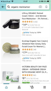
It’s no secret that more and more online sales are done on mobile devices.
Mobile is starting to take a bigger share of online sales than computer sales, according to reports it now accounts for over 70% of all sales. With young people, this percentage is even bigger.
150 million mobile users access the Amazon app each month! So it’s pretty clear that Amazon listing optimization for mobile users is essential.
It’s not just a difference in screen size either. People who are shopping on a mobile have a different mindset to those people shopping on a laptop or computer.
If you’re like me, there are certain items that you’ll happily purchase on your phone while you’re on the go (for me it’s t-shirts!) whereas I’m more likely to buy something expensive like a camera on my laptop.
As always you need to think about your customer when you’re optimising your listing. In this guide I look at Amazon listing optimization for mobile and what you need to consider to make sure your listings convert on all devices.
Product title
On Amazon you have 200 characters for your title, depending on the category you are in. However, on mobile phones this gets truncated, in other words shortened, to just 80 characters and three dots.

You have much less space to play with on a smartphone so that means you need to get all your most critical keywords in the first 80 characters. In these 80 characters you should cover the product type and your top 2 or 3 product benefits using the right keywords.
You need to make these first characters count, as these will be what makes mobile shoppers stop and buy. All the other characters will still be indexed for the search engine, but only the first 80 will be visible to the customer. Make them count.
This is where you will entice customers onto your listing, so make it good. Make it descriptive and have your most important keywords in there.
Bullet points
Only the first three bullet points get shown initially rather than the usual 5 bullets you get on desktop.
So make these ones count. They should include the top selling points of your product. Make sure to use compelling, persuasive language as well as your most important keywords so that potential customers really engage with your product.
However, on the app and mobile, the bullets aren’t shown first like they are on your laptop, the description and EBC is shown first.
If you are in Handmade, the bullet points are in the More Details tab of the edit product page. These appear with your description rather than separately. So they will appear first like they do on mobile.
Product description
Your product description is much more important on mobile than desktop as it is displayed above the bullets. The description is where you can really start to sell your brand and your product to make a customer understand. For example if you use particular materials that are eco friendly, get these in there.
Amazon displays the description in a single paragraph and gives you up to 2000 characters, but only the first 200 are shown with an option to read more.
Use these first 200 characters to paint a real picture of how your product would fit into your customers’ lives and answer any potential questions a customer could have. It’s a chance to convince customers that you’re better than the competition.
If you have enhanced brand content or EBC then it is automatically re-rendered for mobile phones.
Top tip: You can test all this stuff on your laptop by ‘emulating’ different devices on your computer. Just right click a page then click inspect, and you can choose different devices.
Product images
Many customers shop using the image and the title as the main deciding factors.
In fact around 80% of shoppers browse on their mobile first before purchasing something , and you need to make those first impressions count.
This is why we recommend having infographics where you can, but you should also make sure your main image captures the attention of browsers.
Amazon doesn’t have any specific guidelines, but you might want to check out my video on how to make cool product images to make you more sales.
When it comes to product images for mobile users but it’s worth remembering some general principles.
General principles for product images
- Make sure the main image is as big as possible (around 80% of the image frame). You need your main image to pop in the search results so people click on it.
- Make sure the image is high resolution (at least 1000px in either height or width) – this is especially important for mobile users who are likely to zoom in.
- Make sure your images clearly show the key features of your product (e.g. scale, contents, any special packaging or free extras) – this is more important than ever for mobile users who will be looking at your listing on a small screen.
- If your product is roughly a square, then use a square image of 1500×1500. This way the product will take up most of the image and look bigger in the search results.
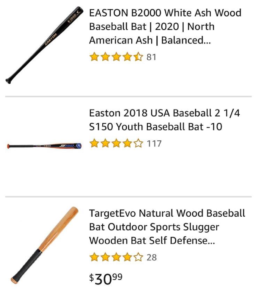
- If your product is long or tall rather than wide (think of a toothbrush or a hockey stick) then use a different image ratio. Just make sure the image is at least 1000px wide. The reason for this is you want the image to appear as big as possible in mobile searches. If you see the example here of baseball bats, on mobile, the images that are diagonal or vertical appear much bigger, so the customer is much more likely to click.
Another thing you could think about is not making the aspect of all your photos entirely square. You could make them a bit more portrait to take advantage of the shape of the phone. This way you can use more of the screen space to make an impact with your customer.

What about EBC and A+ content for mobile?
Amazon will automatically adjust your EBC / A+ content for mobile devices but some EBC layouts look better on mobile devices than others. It’s worth playing around with different modules to see which image and text blocks display your products and brand most effectively while still looking great on mobile.
In the A+ Content Manager you will be able to see what the content will look like on mobile before you go live. Or you can use the top tip I mention above!
If you are using some of the photo sections to add some lists or text, make that text much larger than you usually would so it can be read easily.
So to recap…
There’s no doubt about it, if you don’t create your product listings with mobile shoppers in mind, you will lose sales.
The good news is that Amazon listing optimization for mobile is very straight forward so all you need to do is make sure your content and images are up to scratch. If you want some more info about optimising your listings and images leave a comment below with your question or get in touch!
