My essential guide to creating great product images which really sell your product.
Your product images make the difference between Amazon shoppers purchasing your product or scrolling on by. Amazon gives you up to 9 pictures (depending on your category) and you need to make sure you use every single one to maximum effect.
But don’t panic if you’re not an amazing photographer, as long as you have a high res image of your product then it should be possible to photoshop your product into stock images.
Shutterstock, Pexels and Unsplash are great websites where you can get high quality stock imagery. Pexels and Unsplash are free!
And if you need a PNG version of your product image (i.e. a picture of your product with a transparent background), a great tool to use is Clipping Magic, which costs $3 for 10 images. Check out my video on how to use Clipping Magic.
Lots of high quality pictures of your products from different angles and close up will give shoppers a clear idea of what they’re buying. But there are also a few other Amazon product image requirements you need to consider to optimise your listings.
Amazon product image requirements
First of all, make sure you know exactly what the Amazon product image requirements are:
Main Image (this is the one that shows up in the search results)
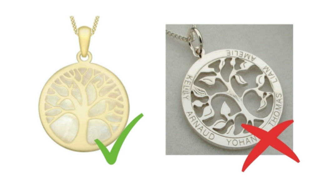
- The Main image must clearly show the product and all its features. Aim for the product to fill at least 85% of the frame.
- The Main image should have a pure white background (This is a new requirement for Amazon Handmade sellers). To make it pure, make the image a transparent PNG file.
- The Main image should be a professional photograph. Illustration or mockups are not allowed
- The Main image should not include text, logos, watermarks or any props that are not sold with the product. There are a few exceptions to this, and as long as you are not confusing the customers by showing them something they aren’t getting, you should be fine. E.g if you sell a wallet, you can have cards or money in there. Customers clearly know the money doesn’t come with the wallet….
- For clothing products, the main image should show the product being worn by a model.
You’ll notice that a lot of Amazon Handmade listings use a coloured background in their main image instead of a white background. The requirement to have a white background is a new rule for handmade sellers and a lot of sellers haven’t updated their images yet.
Sooner or later Amazon will take action and hide non-compliant listings so it’s not worth the risk.
Demonstrate product scale
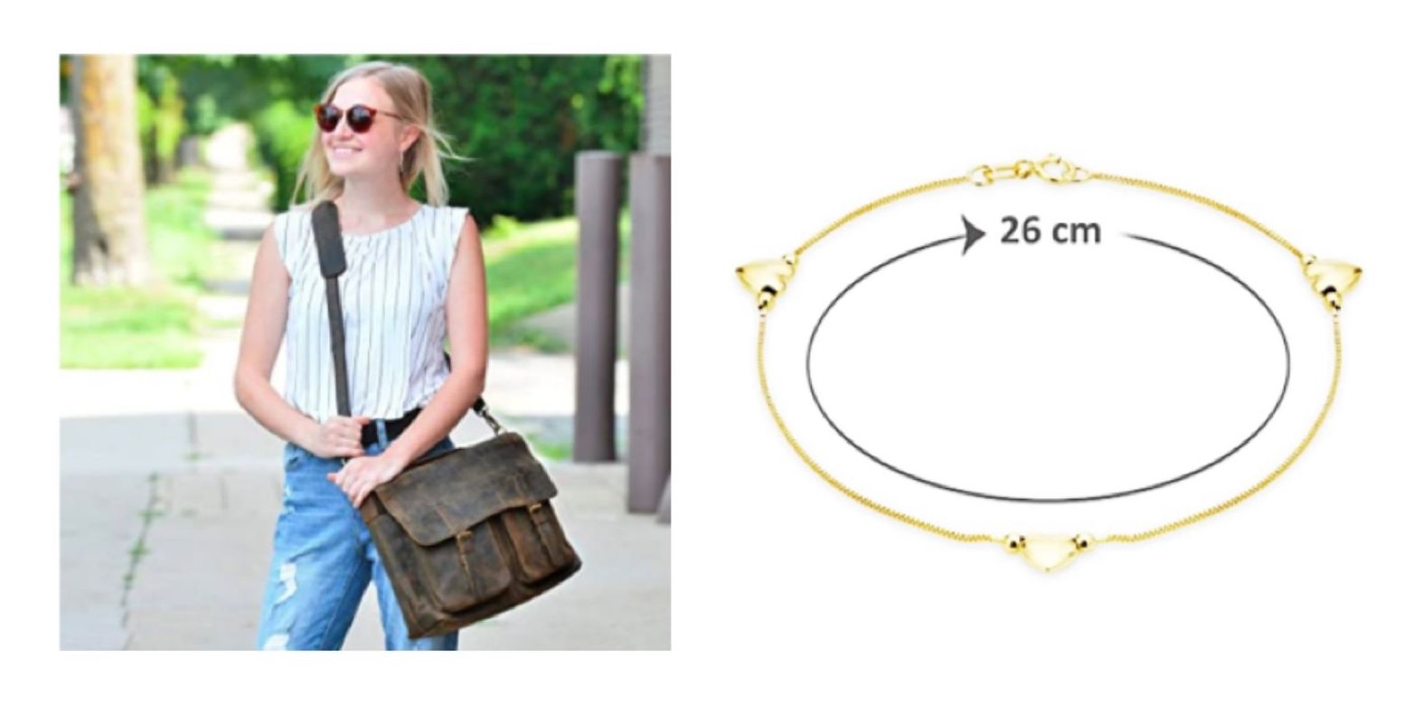
A common reason for returns is confusion over product specifications. Even if you state the dimensions clearly in the product description and bullets, not everyone is going to read it so you must make sure the product specifications are clear from your images.
You can do this a variety of ways: you can photograph it next to another product for scale, or against a person if it’s an item of clothing or accessory.
I also recommend uploading an image with the dimensions clearly written on the product image so there is no confusion.
Use infographics to demonstrate key benefits
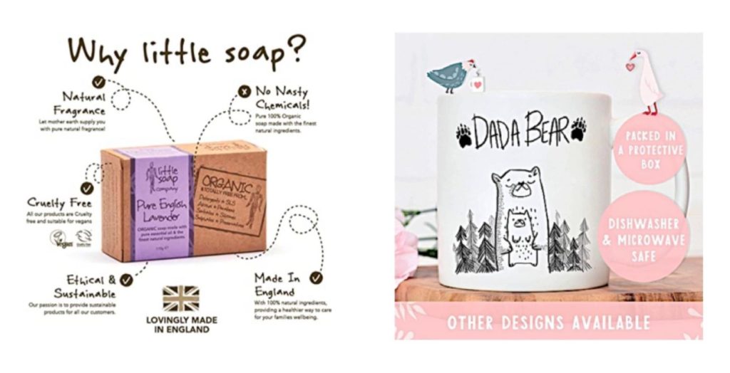
Infographics are an easy way of highlighting key benefits about a product which potential customers might miss if they don’t read the product description or bullets carefully.
An infographic can be a great way to highlight key benefits of your Amazon product (for example if your product is vegan friendly or easy to wash). You can also show your ingredients or provide instructions for using the product.
Also, many shoppers on mobile devices now shop using images alone, so use your infographics to sell your products!
I use Canva to create my infographics – it’s an incredibly easy to use graphic design tool with loads of great templates and there’s a free version!
Show don’t tell with lifestyle images
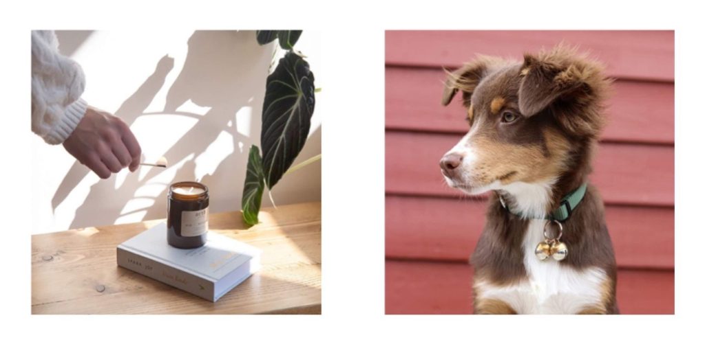
Lifestyle images are an essential way of showing how your product can be used. It might be very obvious to you that your insulated tumbler could be used for keeping cold drinks cold and hot drinks hot, but not all your potential customers will necessarily know that!
You need to show Amazon customers the different ways in which your product could be used otherwise you could miss out on a whole load of potential customers.
Lifestyle images also help customers to visualise how your product will improve their lives. For example when a customer is looking to buy a candle, they’re not just buying a candle, there are much bigger motivations at work.
Maybe they’re looking to make their home more cosy and welcoming for guests, or they may want to light a candle to help them de-stress after a long day at work – lifestyle images can help you tap into these desires and help you connect with customers.
Where possible it’s also a good idea to include people interacting with your product in your Amazon Handmade product images. Research shows that people are far more likely to pay attention to images featuring other people – it helps us to clearly picture how we would use the product.
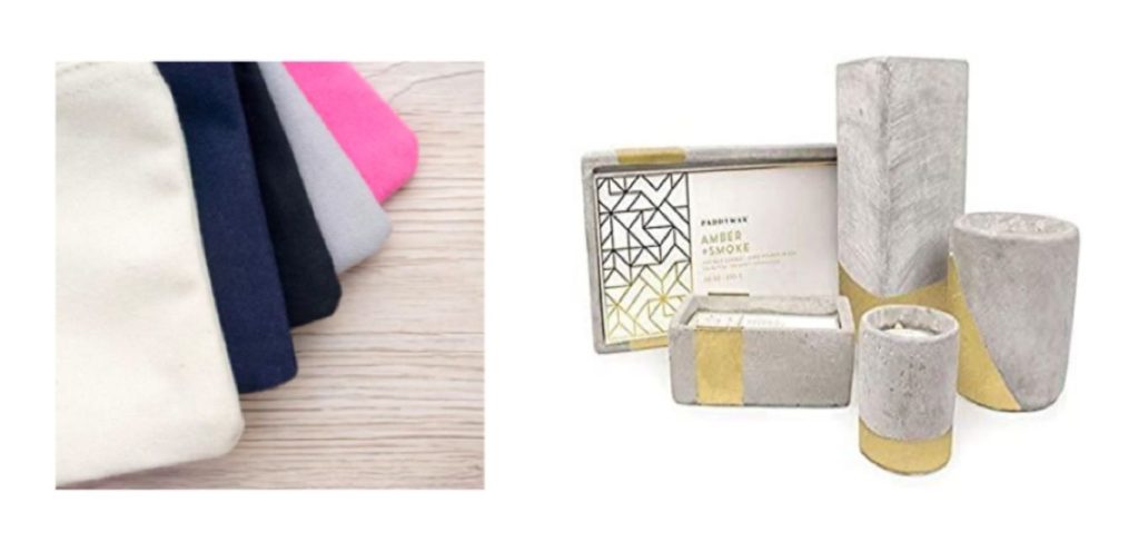
Show your product range
If you sell a range of products in different sizes or variations, then make sure you showcase this within your Amazon product images.
That way you’ll capture shoppers who are looking for different styles and you increase the chance of customers buying multiple products from you.
Show off your packaging
If you’ve gone to the effort of creating beautiful packaging, make sure you show it off!
A lot of shoppers on Amazon Handmade are looking for gifts so attractive packaging can be a real selling point.
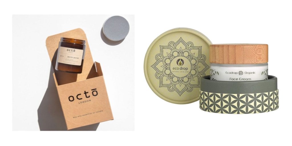
If you manage to include all these picture styles in your image stack on Amazon Handmade then you can be sure that you have shown your product accurately and in the best possible light!
Do you need to remove the background from a product image? You might find my video on how to use Clipping Magic useful:

2 thoughts on “Amazon product image requirements”
Pingback: 5 Mistakes Etsy Sellers Make on Amazon Handmade - Teddy Smith
Pingback: How to write an Amazon Product Listing that Ranks and Converts - Teddy Smith